


Hello everyone!
It's me Quoc Hung again from ABC Software Solutions Company.
Most UI-UX beginners when starting to design a new project are often confused about which font to choose, layout colors or reasonable distances to make their designs stand out. … To help answer that question in this article, I want to share with you a very good library that is the Material-UI library in Figma.
MUI (Material-UI) is not a new topic but it is still very hot. When it comes to Material-UI people will think of React, yes the MUI libraries on Figma also mostly follow React's programming rules. Specifically, let's learn more about this interesting and wonderful topic.
What is Material-UI?

The concept of Material-UI starts from a library of React Components that have been integrated with Google's Material Design. According to the introduction on the homepage, it was built through a strong connection with React and Google's Material Design.
Material UI gives you and your website a completely new interface, with buttons, textfields, toggles… designed in a novel style, instead of the current Bootstrap user's housework. The use of Material-UI helps users save a lot of time from the available Components. With over 20 Components it is probably enough for your website to be lively as well as very easy to maintain the code. Some noteworthy Components:
- Layout: Layout is called the layout for a website. With this part, Material-UI has built very handy Components for us like: Box, Container, Grid, Hidden, Image List.
- Inputs: Inputs are components that are built to receive data and manipulate forms. With Components such as Button, Button Group, Checkbox, Floating Action Button, Date/Time, Radio, Select, Slider, Switch, Text Field, Transfer List.
- Navigations: With built-in components for Navigate or application navigation. It's too convenient and professional when we use this UI library. Framework has built-in Components such as: BottomNavigations, BreadCrumbs, Drawer, Link, Menu, Stepper, Tabs.
- Surfaces: Material has also created for us a frame that contains available content, we can use Components such as: App Bar, Paper, Card, Accordition.
- Feedback: We have Components that help disable custom functions on the screen and wait for the response of those components to be able to work again. There are a number of components like: Progress, Dialog, Snackbar, Backdrop. In it as simple as Cmponent Progress we can create a Loading effect that waits for a response from the backend and then turns off Loading.
- Data Display: Material-UI has supported us with basic data display methods that almost have everything needed on an application with Components: Avatar, Badge, Chip, Divider, Icons, List, Table, Tooltip , Typography format for text).
In addition, we can also take advantage of a lot of other Components to help our website become more professional such as: Modal, Poover, Transitions… everyone can go to the homepage for more information.
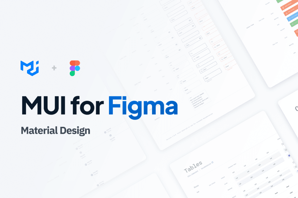
Material-UI in Figma
To create a beautiful user interface, it is necessary to follow a lot of rules in design (Color, Typography, Contrast, Spacing, Grid, …) these rules will mostly be numerous and confusing for beginners. I started learning Figma design, so Material-UI in Figma was born, helping designers have a more intuitive view and easier to build designs.

With Material-UI in Figma we can take advantage of the libraries shared by designers around the world on the Figma community, open the Material-UI library right away that will answer all your questions. Like React Components, Figma also has Components to share, Components in Figma have the main function of helping designers easily manage layers as well as help create and manage consistent designs across projects.
When working with a programming team, you should use a unified set of Material-UI that will save time as well as ensure that there will be no minor errors throughout the project implementation process. As a personal designer, after receiving the guidance and help of Mr. Tin Tran (Developer with many years of experience) has launched a UI Kit in the standard style of Tailwind CSS code. With the use of the available resources of Tailwind CSS (color, Spacing, Typography, Borders, Effects, SVG,…) now when embarking on a new project, just using the preconfigured resources is very convenient. profit.
Personal opinion

Of course, about beauty, everyone's personal opinion is different, you may find the Material-UIs on the Figma community are not eye-catching or do not meet your design goals. Build your own UI Kit and share it with everyone.
As for convenience, it's clear that Material UI has provided more than enough for a project, making our individual or group work faster and more perfect. In addition, you should also refer to the designs on Figma's community to save impressive designs, contributing to your design skills and logical thinking.
Through this article I would like to introduce about Material-UI React as well as Material-UI on Figma and the great benefits it brings to designers. Hope this article helps people to some extent in choosing your design style.
I'm Hung, thanks for your interest in my Blog!!!